The Perfect Place to Make Your Ideal Look
The Perfect Place to Make Your Ideal Look
THE BRAND
Zeglio (pronounced: zeh-lyo) specializes in crafting bespoke, hand-tailored garments designed to complement your unique frame and taste. With storefronts in San Diego, Irvine, Chicago, Los Angeles, and Beverly Hills, we offer premier custom suit and tailoring services that cater to the most discerning clientele. Our mastery in delivering fully customizable suits ensures that every preference is met, whether you desire a modern trim, classic cut, black-tie elegance, or casual sophistication.
At Zeglio, we take immense pride in creating exquisite, custom-made suits that fit you flawlessly. Our made-to-measure approach guarantees you will exude confidence and style at any event. We also specialize in crafting exceptional wedding attire, ensuring you look impeccable on your special day.
Experience the epitome of sartorial excellence at any of our nine global locations. Our dedicated staff will guide you through the entire process, from fabric selection to style customization, and assist in matching accessories. You’ll be impressed by the meticulous attention to detail that defines every Zeglio garment. Visit us and discover the look you desire and the comfort you deserve.
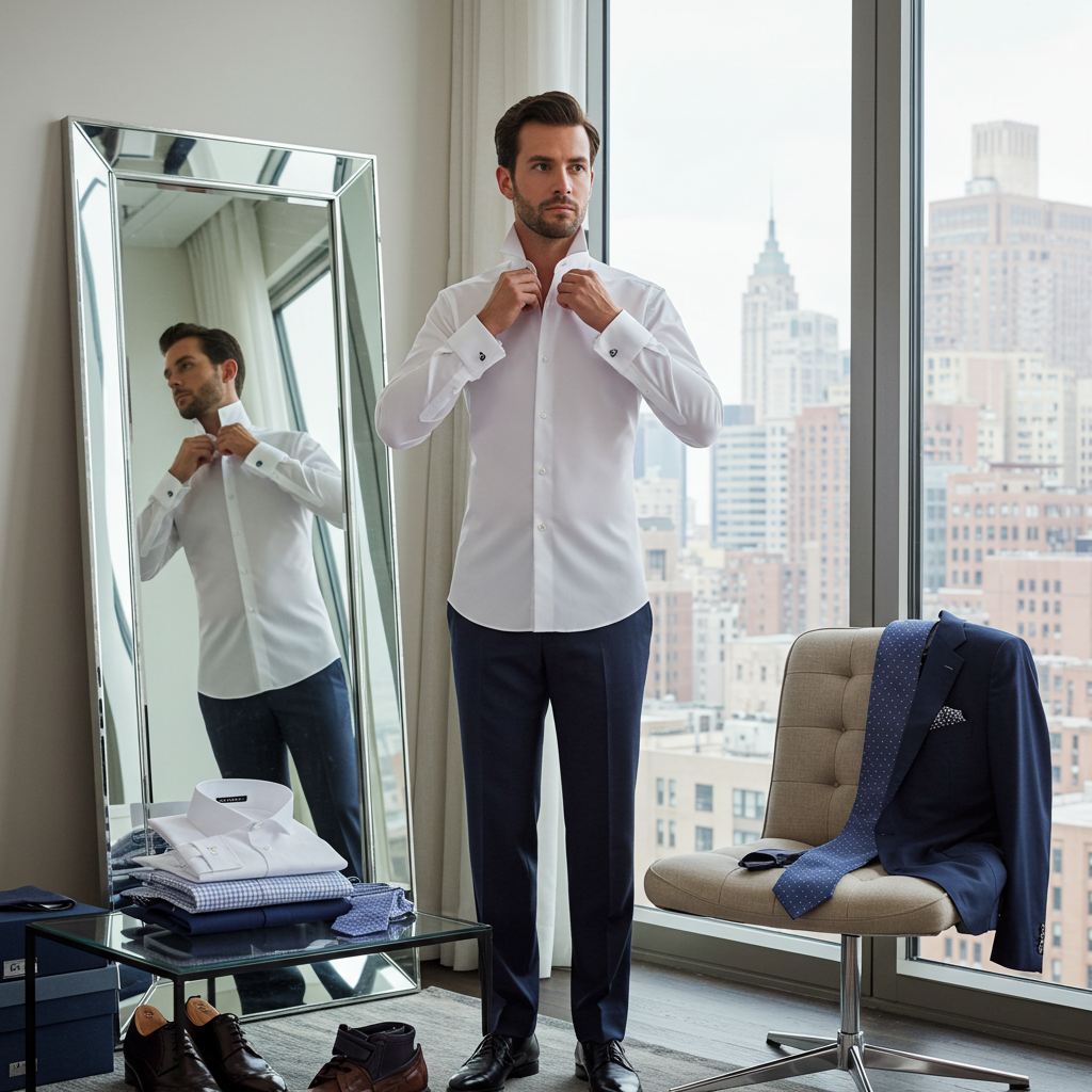
CUSTOM SUIT
Zeglio Clothiers’ suits are designed to make you look and feel impeccable for any occasion, whether you’re navigating crucial meetings or celebrating your wedding day. Each suit is meticulously crafted to reflect your individuality, from the style and cut to the fabric selection and detailing. With Zeglio, you’ll find a trusted partner dedicated to creating clothing that fits perfectly and expresses your unique personality, enhancing your confidence with every wear.
CUSTOM SUIT
Whether you are a businessman who often attends crucial meetings, are getting married, or just always like to make a good appearance, suits by Zeglio Clothiers will help you look (and feel) your best, whatever the occasion. Custom designed and tailored, they will unmistakably show that you care enough to want to make a fine impression. Careful styling can display your personality and build self-confidence, and Zeglio is your ideal partner to create clothes that express you, uniquely.
Our clothing is not merely “customized” – using a basic template adapted for different buyers. It is truly “bespoke”: That is, every aspect from the basic style, cut, fabric, stitching, detailing, etc., is individually selected, then tailored, for each client. Our designers have extensive experience and a passion for presentation to help you define what you want your suits to ‘say’ about you, and curate the appropriate fabrics and details. To find your ideal look, please contact Zeglio Custom Clothiers for an initial consultation, free of charge.
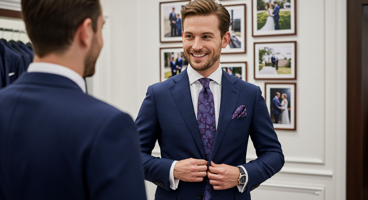
CUSTOM SHIRT
At Zeglio Custom Clothiers, our shirts are uniquely selected, designed, and tailored for each client, offering unparalleled versatility and impact. Meticulously crafted to fit impeccably and enhance your overall aesthetic, our shirts embody true bespoke craftsmanship. Whether for a special event or daily wear, Zeglio will exceed your expectations with shirts that align with your style and elevate your appearance.
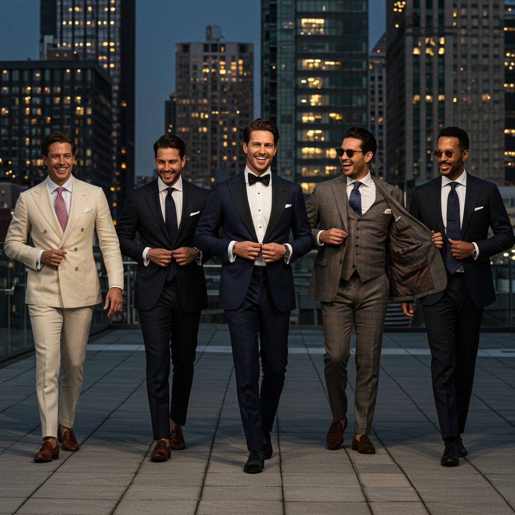
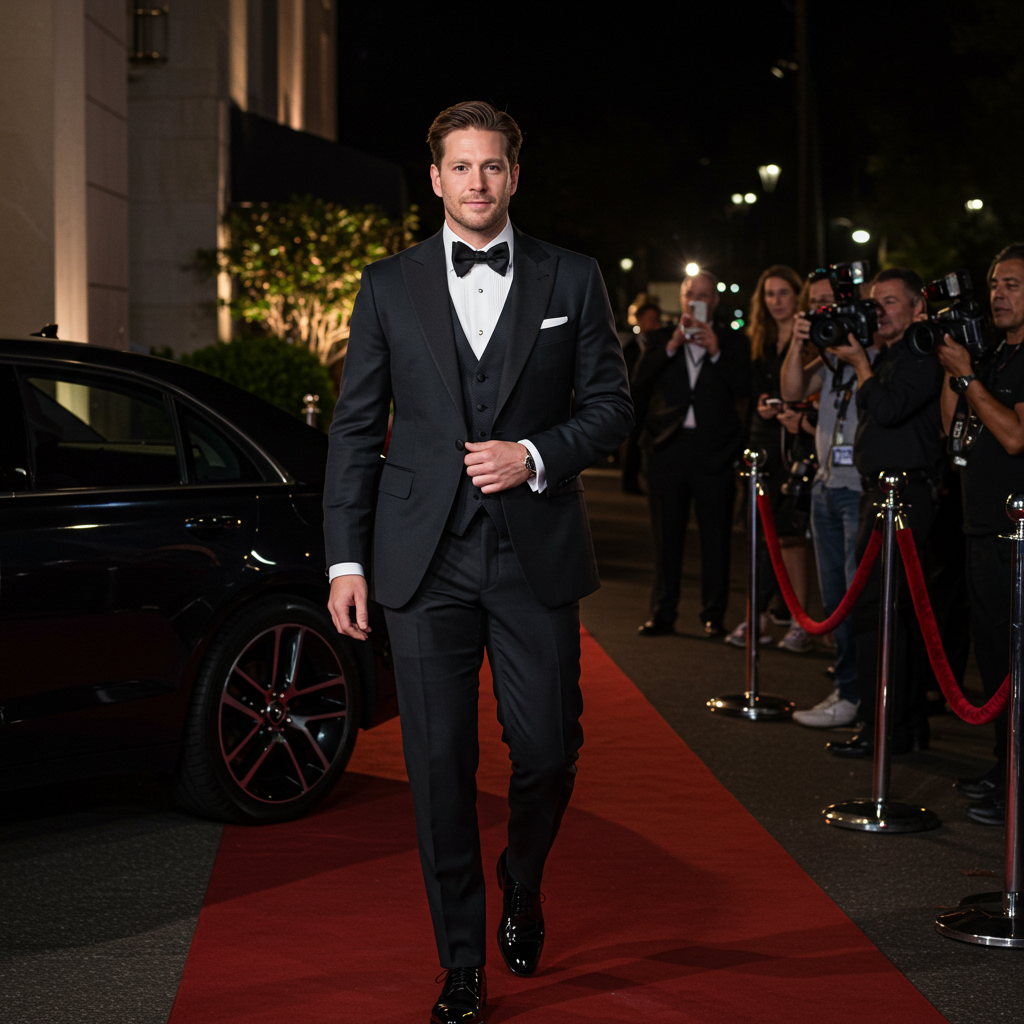
CUSTOM TUXEDO
Zeglio Clothiers specializes in creating bespoke tuxedos that epitomize elegance and sophistication for any formal occasion. Meticulously crafted to your exact specifications, our tuxedos ensure a flawless fit and unparalleled quality, showcasing your appreciation for the significance of the event. Trust Zeglio Custom Clothiers to elevate your presence at your next formal affair with a tuxedo that exudes refinement and elegance.
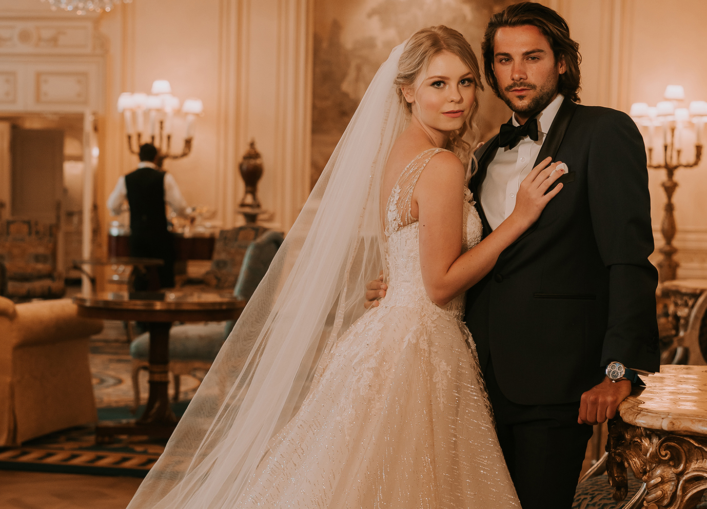
WEDDING
Let Tailor Made create a wedding suit that matches the significance of your special day. Working closely with our expert tailors, you’ll design the perfect wedding suit that embodies your personal style and flatters your figure. From selecting the finest fabrics to the final fitting, we prioritize your satisfaction, aiming to create a suit that looks flawless and instills confidence as you celebrate this significant milestone. Contact us today to begin the journey toward a wedding suit that will be treasured for a lifetime.
This error message is only visible to WordPress admins
Error: No feed found.
Please go to the Instagram Feed settings page to create a feed.
Thanks to our photographers, wedding gown designers, stylists, wedding planners, models :
@luyi.zhao @angelicaantonette @samfuphotography @janaanncouture @truephotography @scottymoson @nolandeanle @roseweddingphoto @graceandsoul.photography @hcprophoto @lzgphotography @sarabiaphotography @zean.lugtu @michellelillywhite @corinjonesphoto @aubreelynnphoto @scabal @mylesds @kayla_lynn_anderson @olswang @lovelyjacksons @coco__kat @katdaddy_the @patmybuns @princessmarshayshay @theforestshootout @sarahmay_designs @theproposal.bridal @cfwarrior_ashley @andremontano @amandampedroza @austinmaesvalley @rick.rodstrom @laurapaulyyyy @poshbrides_sd @lindzhope1223 @jacobbasheer @elena.u.photography @aubreelynnphoto @jacobbasheer @scottymoson